Before & After: Fun Family House Transformation
Today I’m so excited to share some more details with you about one of my favorite projects, which we call the “Fun Family House.” You may have seen this one featured in Country Living, and I thought this was a great opportunity to help our readers understand a bit more about our process and how we work with design clients. Here’s the inside scoop!
Our Process
Quite simply, our design process starts when a client contacts us because they’re having an issue with their space. From there, our role is to clarify the issue, zero in on what’s causing it, and help them solve it.
This client called us because they were having a hard time figuring out how to solve a layout issue in their home. They’d spoken to some architects, but were hoping for a more cost-effective solution that didn’t involve completely rebuilding their house. They had over 3,000 square feet, but they were hardly using any of it because flow just wasn’t working for their family.
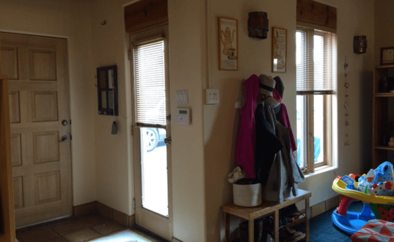
When Matt & I visit with a new client, we start by asking a TON of questions. Some might seem weird or intrusive, but being all up in your business helps us understand what’s really causing the issues you’re experiencing in your home, and how we can truly fix it.
As we ask these questions, we’re listening to what a client says (of course!), but we’re also listening on a deeper level: for unstated issues that might help us get a clearer picture of what this client really needs.
For example, someone might say, “I want a library in my house,” when what they really mean is “I need a space to read and relax by myself!” By understanding what they actually need, we can fix that issue using great design on a much smaller budget—that’s the value you receive when hiring a professional designer!
Define the Problem
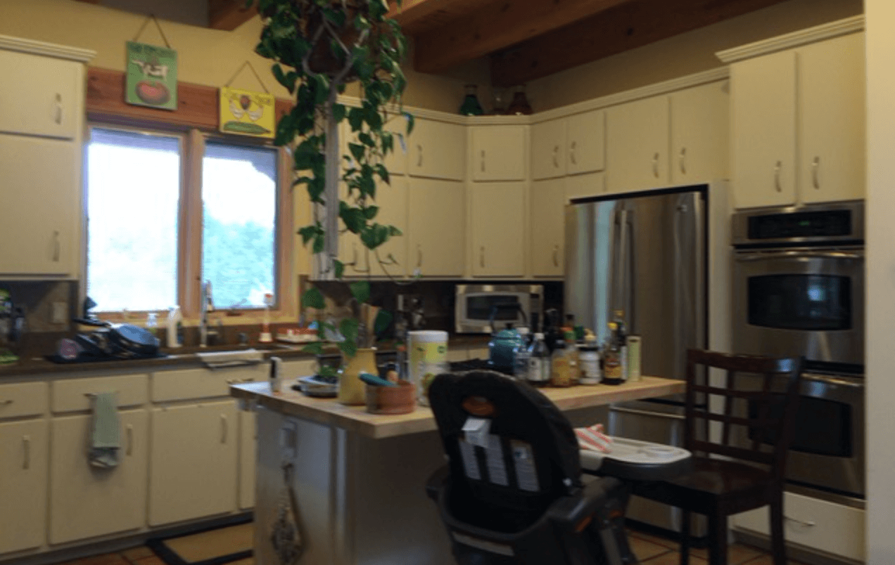
This client has two young kids who are both extremely active, and they wanted any solution we designed to integrate their children’s needs. They didn’t want the kids totally separated; just not toys underfoot while you’re cooking in the kitchen!
Together, we decided their main issue centered around flow: efficiently using the square footage they had while giving their kids a chance to stay occupied in their own areas.
The dad also really wanted an office space, and Matt got to use his super-problem-solver chops figuring this out for them. After talking with the family extensively, we realized there was an emotional attachment to the large bookcase near their dining table, because it defined the space he currently used for organized work and quiet time.
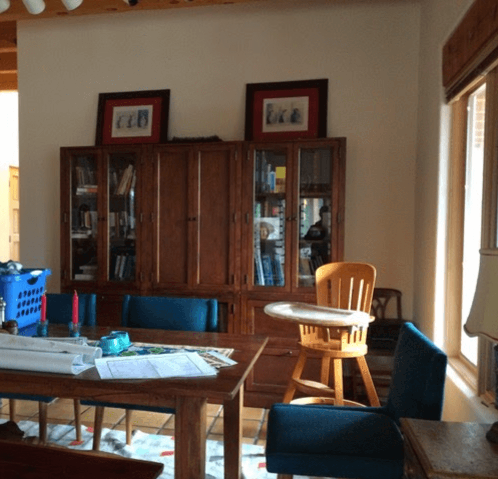
Moving this bookcase and knocking down the wall behind it would allow us to open up their main living space, which is what they really wanted. But you can understand how that big change would feel concerning if a client associates the current room with their family’s order, structure, and planning. There would be no place for the treasured bookcase.
When we come into projects, often there will be some sort of emotional sticking point like this—again, it’s our role as professionals to figure out what is holding up the decision making process and help move past it if we can.
A Design Solution
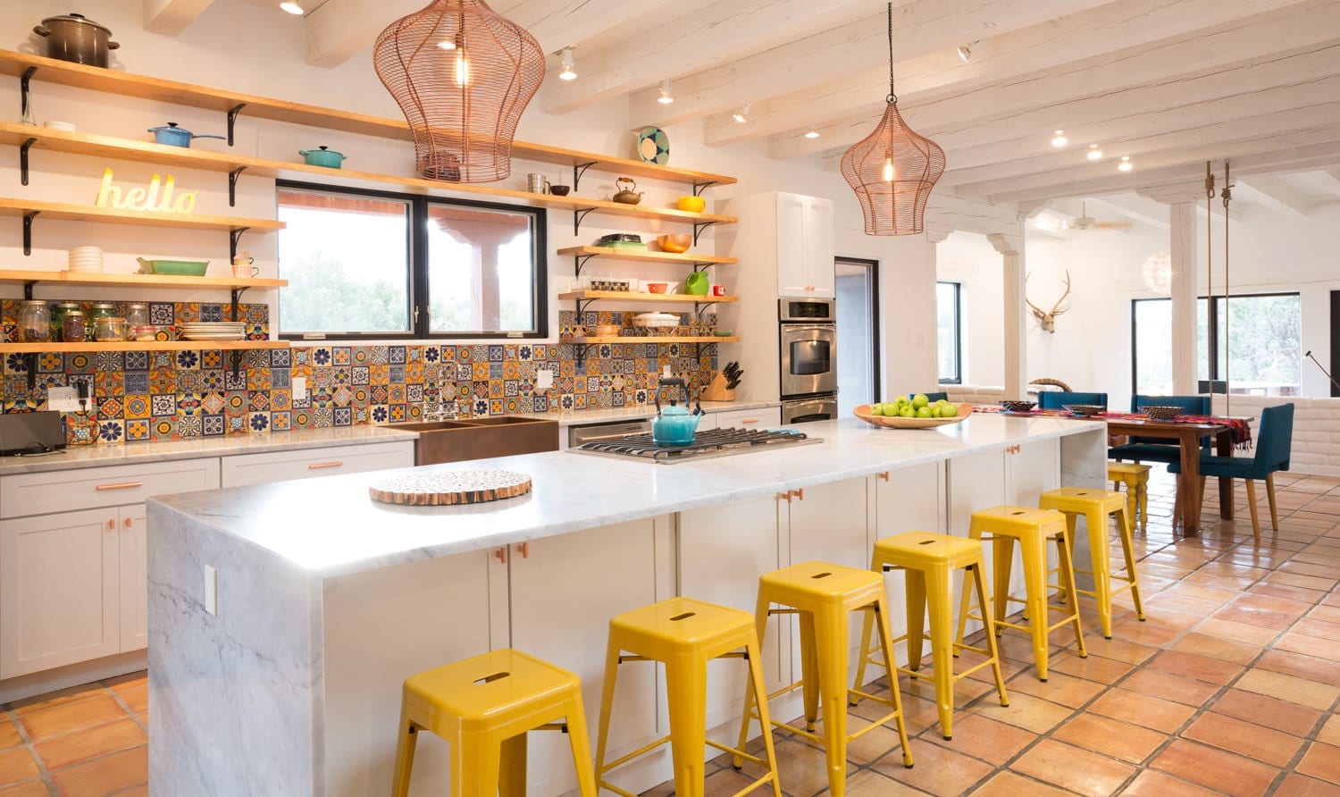
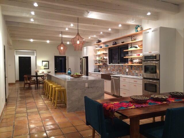
Luckily, Matt is great at solving puzzles like this! Together with the family, we ultimately decided on a design-centric solution that included minimal remodeling. We removed the wall, reoriented the kitchen, and met all their needs with design updates everywhere else in the house.
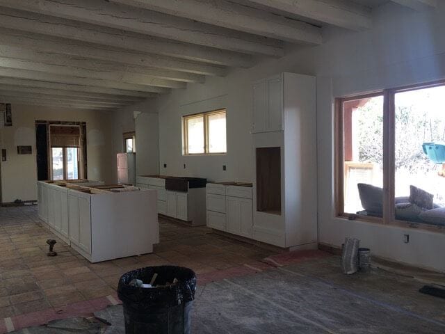
When the wall came down, Matt figured out how to repurpose the bookcase into a new workspace niche in their hallway. We used the hutch’s cabinets as built ins, repurposed the drawers, and added a desk to make a dedicated workspace that preserved that important piece of furniture.
Solving this problem really allowed us to complete the rest of the job cohesively — which was great because this was one of my favorite projects ever! Such an awesome family and just a joy to work with.
Enjoy the Results
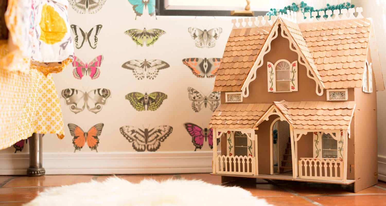
For the kids, we got to be really creative with the play areas, which are also integrated into this home’s main living spaces. The parents didn’t want their kids relegated to a totally separate play room, but wanted fun things for them located in each “public” space (living room, dining room, kitchen, etc.).
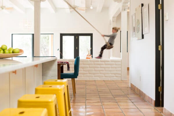
To keep the kids occupied, we installed an adorable teepee, an art area in the main living room, and a swing in the dining room! It sounds weird, but is super fun and gets used a ton…and it can always be unhooked if necessary!!
The updated flow also gave this family access to their great outdoor patio that wasn’t used before. Now their kids can play outside with just enough supervision to feel comfortable.
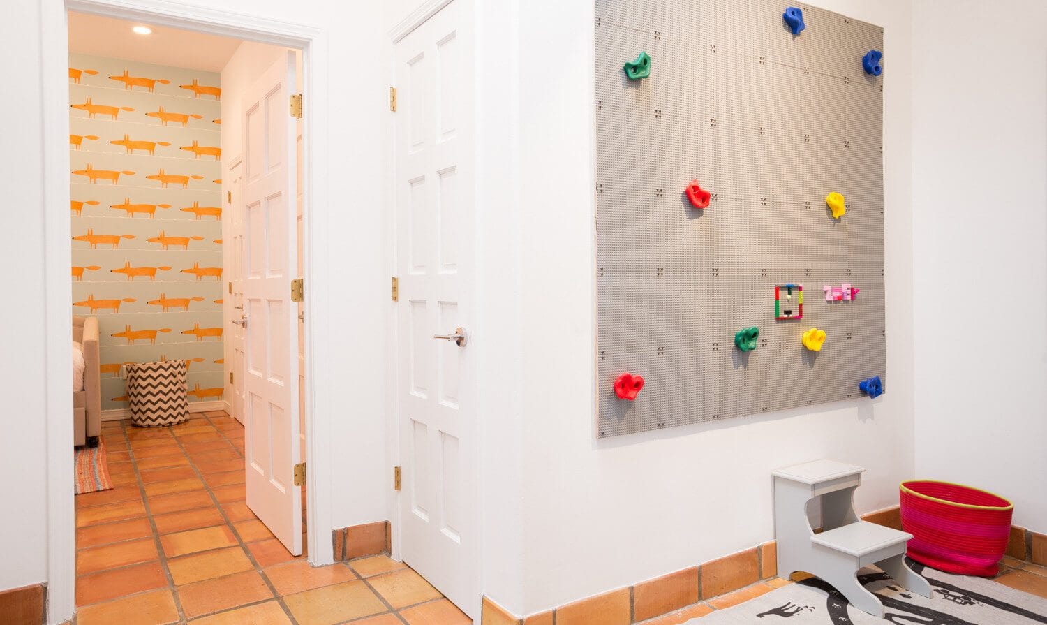
We also added a doorway to the hallway that can close off the kids’ rooms if necessary, which helps parents with early toddler bedtimes and gives kids more independence to play as they get older. This area includes a book wall, a Lego climbing/building wall, and redesigned bedrooms for each child.
To help with the client’s budget, we just updated the countertop and fixtures in the kids’ bathroom—same cabinets, same tub, same layout, new paint!
A Beautiful Happy Ending
Overall, this project was a massive transformation, and I’m so happy that we were able to help this family using a simple design-focused approach. Matt and I love working with our team on architecture-based remodels too (for example, if there’s a home that legitimately doesn’t have enough space!). But I do love the creative out-of-the-box thinking that helps execute a really great product using the design process.
I especially love how this family integrated the needs of their kiddos into their design choices. This is something I try to teach Isla too — her ideas and needs as a person (however small!) are totally valid. I’ve seen that kids really value design and beautiful spaces, and I think this appreciation is actually inherent in most of us.
A room that’s well-designed and functional for children will actually help them use it correctly. They might need some extra encouragement to put their toys and games back where they came from, but if it’s easy, they’ll get it eventually…they can pick up on what that space is designed for.
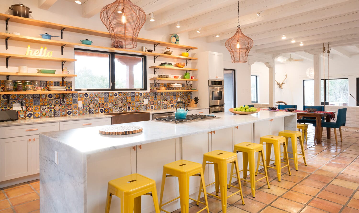
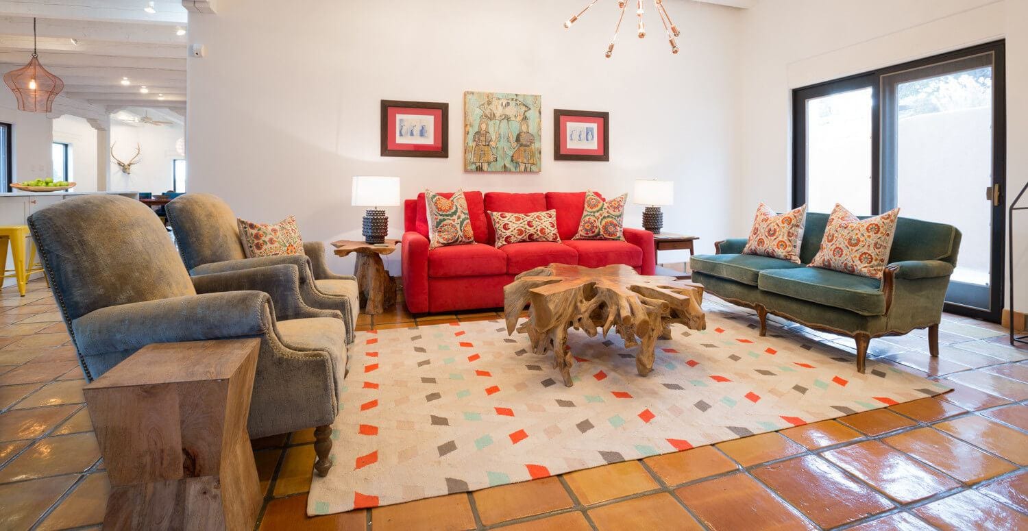
We all naturally spend more time in the rooms we feel good in. You know—everybody’s got that room that isn’t super functional…it always ends up as wasted space or disorganized storage! By giving our clients rooms that are well-designed and functional, we help them feel good in their entire home and use it the way it was intended: as a space for their family to thrive.
One last thing, before you go: if you want to keep getting style tips and inspiration from us, feel free to
Sign Up for Our Mailing List


