Teaser Preview: ShowHouse Santa Fe 2017
ShowHouse Santa Fe 2017 is right around the corner, and I wanted to let you in on some quick tidbits of our design! Make sure to buy your tour tickets in advance to experience all this gorgeousness in person.
We love being a part of ShowHouse, and are excited to be back for this 5th Anniversary year. If you’re not familiar with the concept, basically 20+ designers each take one room in a home and work independently to create a real-life showcase of Santa Fe’s best design — all in one place.
The home itself will ultimately be sold, and the design event is a fundraiser for Dollars4Schools, a local organization that helps provide backpacks, school supplies, after school programs, extracurricular activities, and much more for Santa Fe’s kiddos.
Here in Santa Fe our design community is really close-knit, and Matt and I have such fun working with all the talented folks involved in ShowHouse. All our time is donated, and we fund the product ourselves to furnish the space. We are thrilled to be doing a child’s room this year, and we hope you’ll visit us during the open house weekends!
This year’s theme is West of Contemporary: A Journey in Black & White. Though the aim is to create a more “formal” feel this year, all us designers still get to basically run with whatever inspires us. Since designers rarely get to work without constraints like this, it’s a great exercise in nurturing our creativity. As a result, ShowHouse always ends up being very, well…showy!
Where to Start?
At the same time, working without guidance from a client on their own style, budget, and other requirements can also be a challenge. Sometimes I have a hard time starting with such a blank slate!
This year, our room includes a replica of an adobe pueblo that really defines the space. We took a lot of time to think about how we should incorporate this, and ended up going with a more casual design than what we’d normally do for a kid’s room.
Ultimately we created more of a children’s crash pad, since this entire property is more of a “grandparents’ house” than a home for a family with young kids full-time. Our design will include multiple sleeping spaces, plus plenty of room for playing games, doing puzzles, and good ol’ hanging out.
Once this purpose was defined, we could figure out the specific floorplan and choose our sofa, chairs, fabrics, etc. With such creative freedom, I really wanted to do something a little more out-of-the-box than your typical toddler furniture….and I can’t wait for you to see the final product!
Bringing Patterns to Life
Though kids’ room projects are highlighted often in our work at French & French, I still wanted to push ourselves beyond the basic with this ShowHouse opportunity. Lots of people know what we do well, but on this blank slate I really want to showcase something folks might not expect!
For this “kids’ living room,” we made sure to keep everything functional but still fun. We’re usually pretty bold and daring with our design choices, and this project is no different. Here’s how I went about making some of these choices for this project:
Pick a keystone fabric
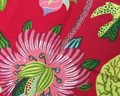
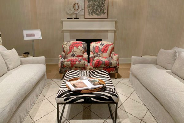
For this room’s keystone fabric, I was really drawn to this lively pattern with the red background. The organic theme keeps it grounded, but all the bright colors obviously add some major fun! The dots and stripes integrated into the plants also provide lots of options for our next step…
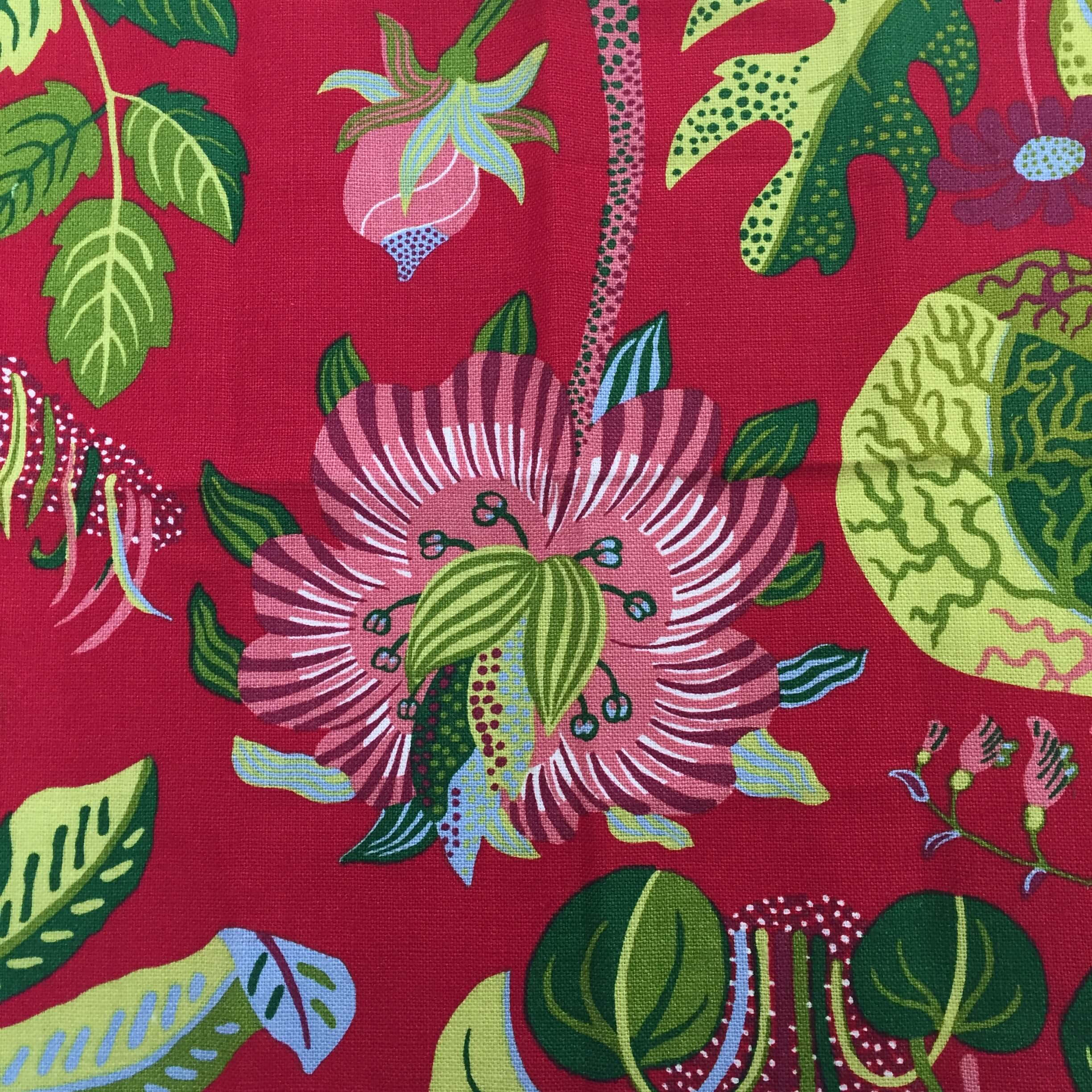
Pull other fabrics with varying scales/colors
Once I have a keystone fabric chosen, it’s time to pull related fabrics I want to layer around the space. This keystone gives me opportunities to work with other reds, greens, and light blues in different scales.
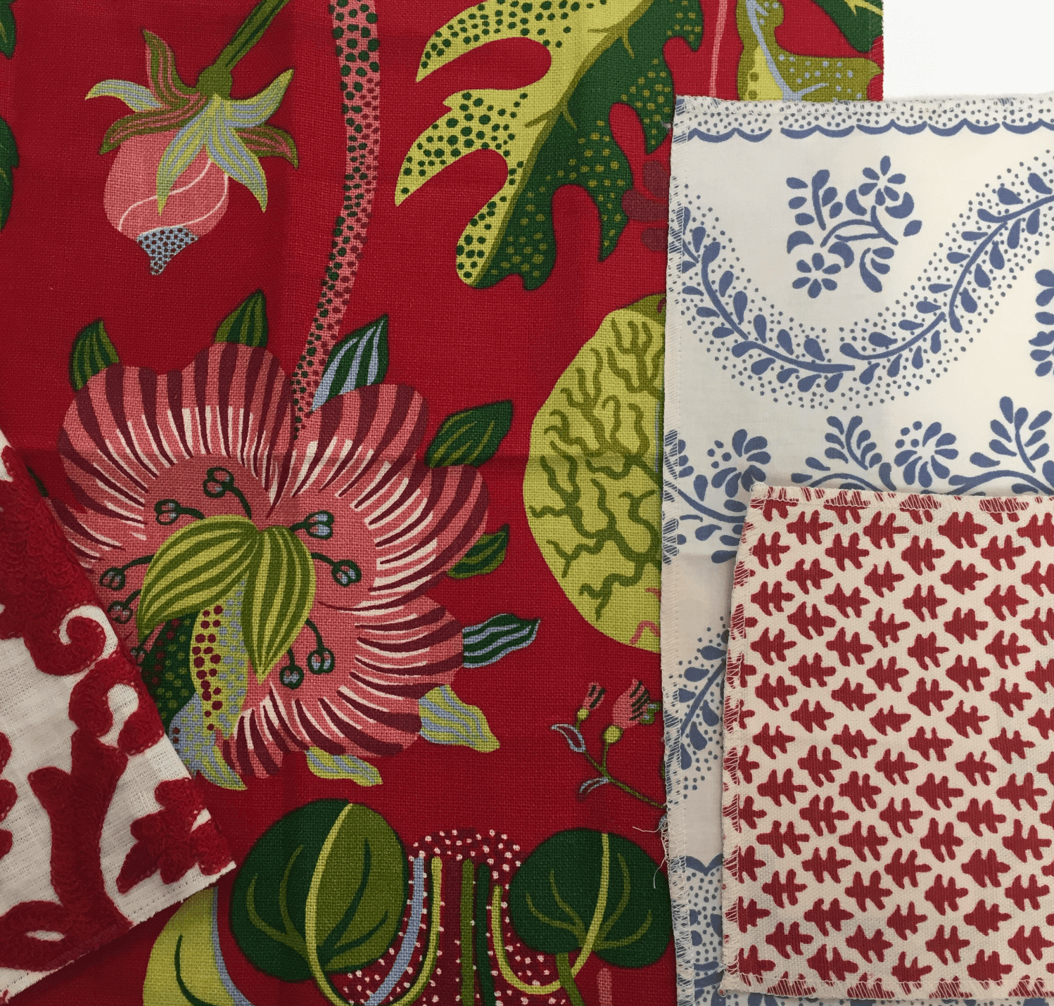
I’m never afraid of mixing patterns, as long as you vary the scale. Since our keystone started out so large, that gives me lots of room to play around with multiple other sizes.
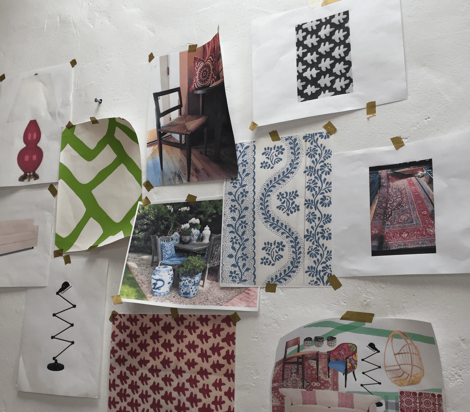
Repeat with even more variation!
My final step is simply a continuation of Step 2, but this is where you start getting into design that looks very professional and purposefully chosen. Again, move through variations in scale/pattern/color to bring in even more details within the same “family.”
This is where I started bringing in multiple blue patterns, which are less bold but still pull from the keystone fabric. You can see the scaling is still slightly different, but the repeating dots give some continuity. Since they all relate well, layering these in one space won’t be a problem.
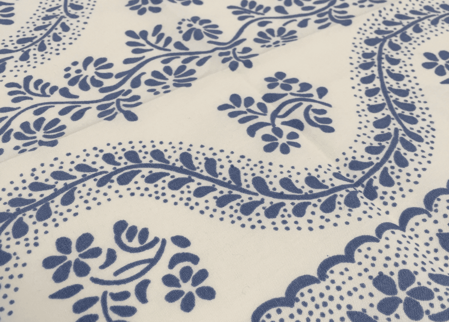
If you’re implementing this process to choose fabrics for a space, you can basically just keep taking the scale down and repeating colors. Scaling is really, really important, and following this process is why good design works!
Start by knowing your space (ours is large so a big, bold pattern makes a great keystone), and then just commit to using your colors and patterns. I’m never afraid of too many patterns…but I do usually stay away from “shiny” fabrics because they can look garish in a bold pattern.
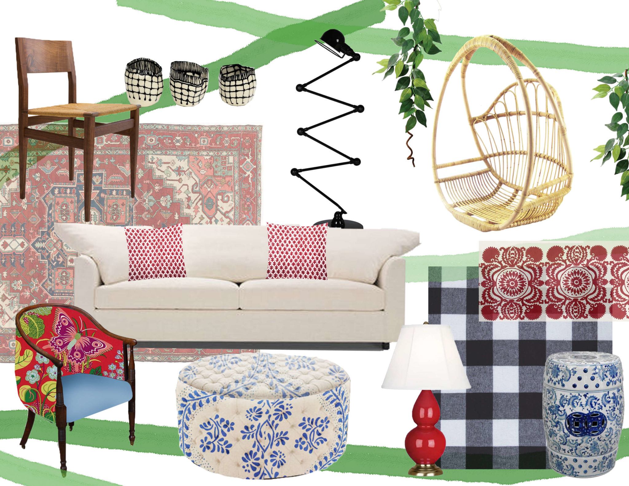
I hope this tiny teaser whets your appetite to come check out the rest of ShowHouse Santa Fe in person!
We will be doing instagram stories all day tomorrow during our install, so we’ll see you over at frenchandfrenchinteriors!
See you there!
One last thing, before you go: if you want to keep getting style tips and inspiration from us, feel free to
Sign Up for Our Mailing List


The collaboration that Heather and Matt is weaving on these projects is impressive. I love the colors and texture gathered in their work!
Oh my gosh!!! So exciting! I can’t wait to see the room! I’m loving all of the fabric choices! I absolutely love the mix of colors and patterns that you’re going with! It’s going to be amazing! You’re so talented!