French & French’s ShowHouse Santa Fe 2017 Showcase!
Once again ShowHouse Santa Fe is complete! Matt and I are so happy with how our room turned out this year!
Also, we are starting something new with our blog posts. Now, you can use our affiliate links to “Shop This Look” and buy the furniture, fabrics, and the other assets used to make this blog post! Check it out here:
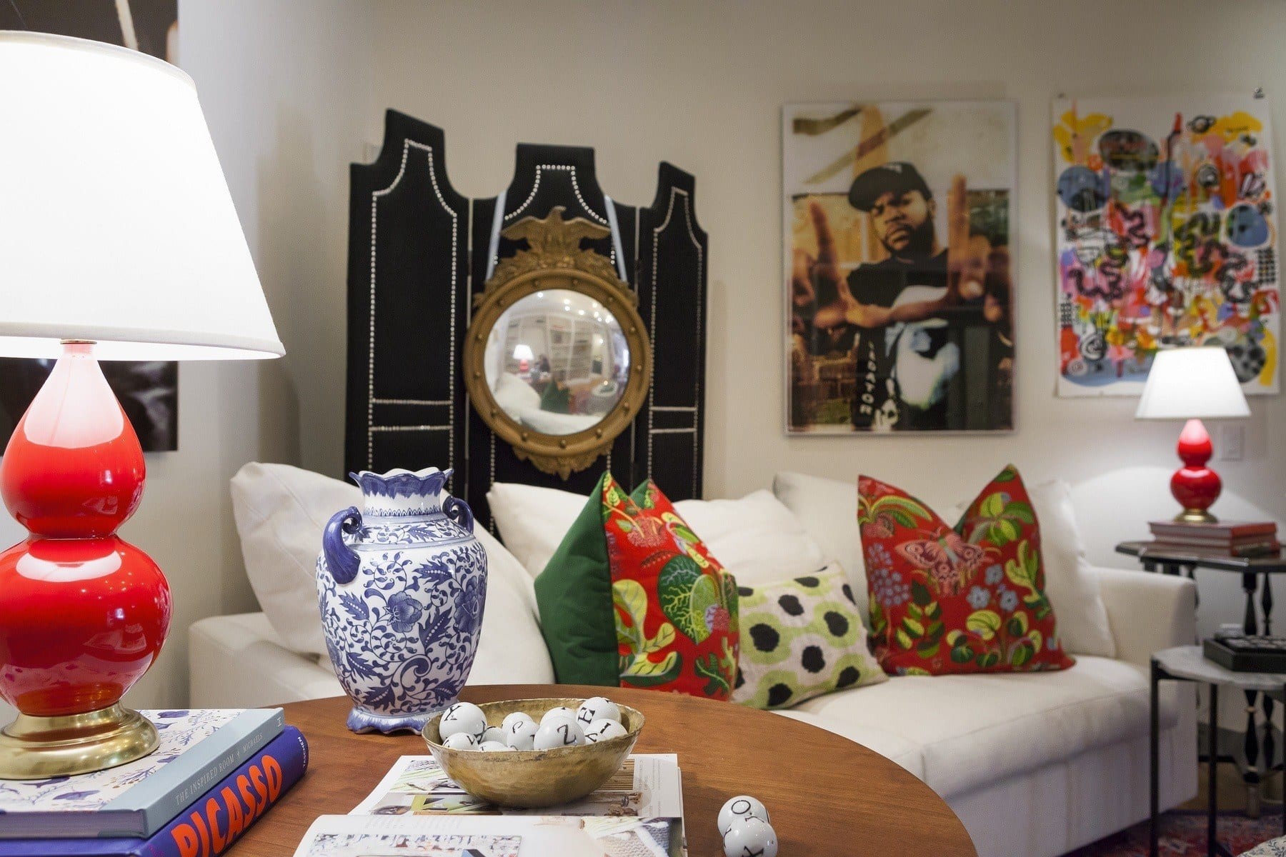
…Now here’s a quick look at the final product:
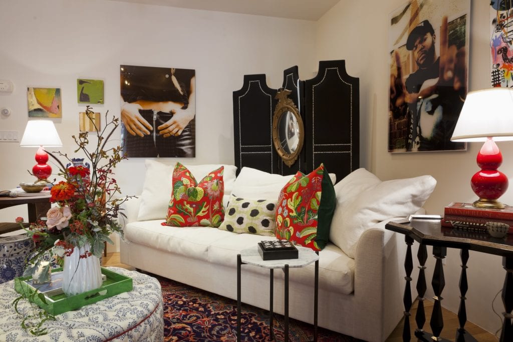
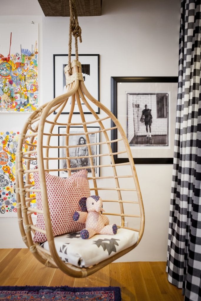
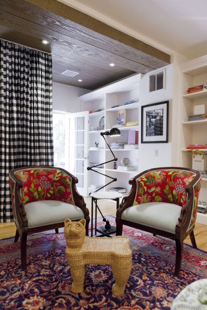
The ShowHouse 2017 Process
If you saw our preview post, you know we had big plans for this room with tons of bold patterns and colors to mix and match. While that’s not too far outside the French & French comfort zone (as you probably know!), this space did come with one challenge: a built-in pueblo-style bed.
Because of this, it took me a while to wrap my head around this room being a kids’ space and how to use it. Ultimately, we ended up draping the bed to turn into more of a playspace than a permanent sleeping area. When we saw the kids come in and automatically close the drapes to make an instant tent…we knew this would work!
They ended up having a blast, and our mental hurdle turned into yet another defining feature of this space — especially when we added the wicker swing!
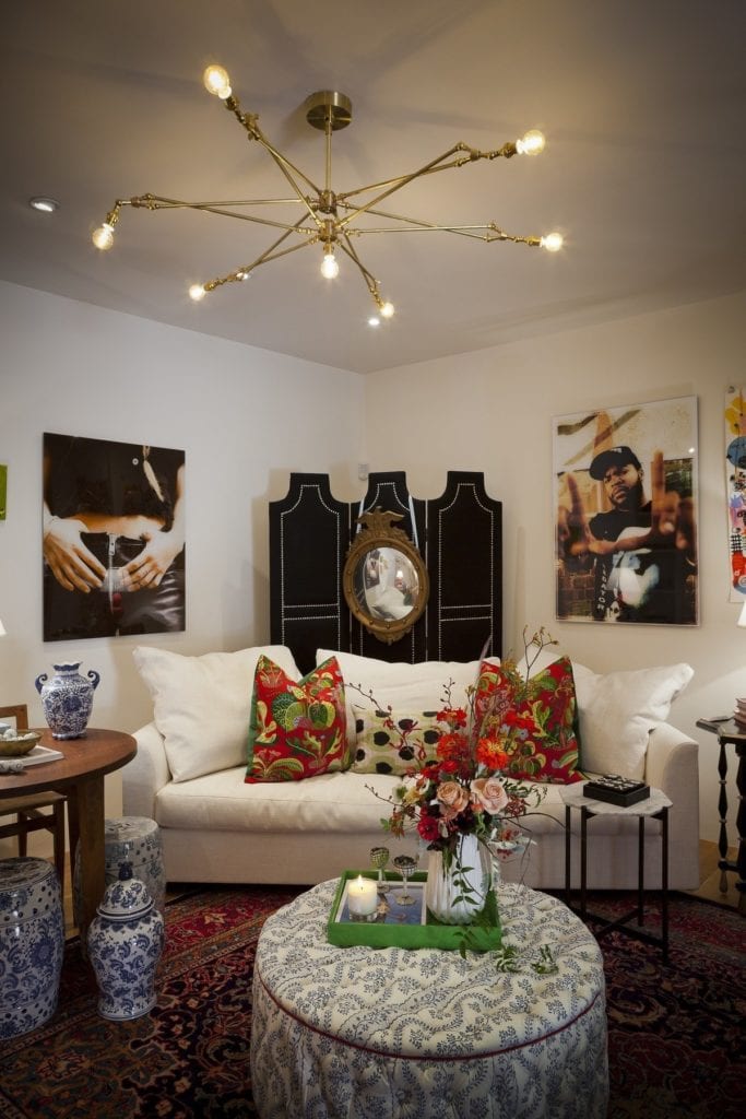
The ShowHouse 2017 Mentality
Every ShowHouse year has its differences, but the spaces and purposes are always assigned to participating designers. For us, doing a kids’ room felt a bit more familiar since we’ve done lots of other family spaces in that more whimsical style (even using other built-in features to amp-up the fun factor).
ShowHouse’s founders are also great about placing designers in spaces that help them grow. For us, that meant working on a more sophisticated, layered level than we might have tried for a client’s project — this was definitely more extreme!
Really, ShowHouse is an amazing chance for us designers to push boundaries and spread our wings a bit every year. It’s almost like fashion in a department store vs. what you’d see on a runway: high-fashion runway shows are meant to serve as an inspiration. This is where designers are trying to evoke an emotion — to help people expand their own thoughts about what’s possible, and not be afraid to try something out.
So while I might take several aspects of this room and use it in a client project, it probably wouldn’t be an exact reinterpretation, just because of how bold the final product turned out!
Get more inspiration right in your inbox
Our Details
Even though using this whole concept would be a bit overwhelming to live with every day, I did end up re-using some of the pieces in our own bedroom at home. This is a great example of taking some aspects of an “extreme” design that inspires you, and repurposing them into your own liveable space.
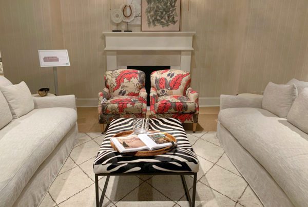
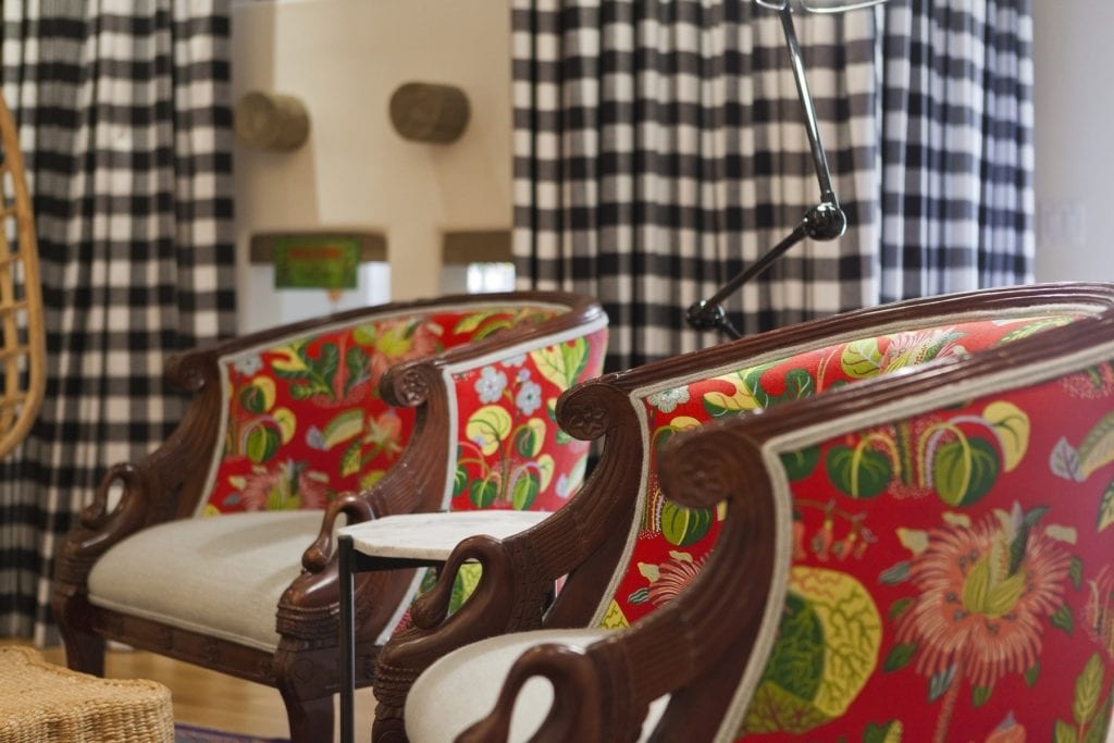
Here you can see we placed the bold red chairs facing the bed with the ottoman. We also placed the tall black screen back in the corner, and used some accent pillows from the sofa on our bed.
Don’t ever be afraid to pull things you like, move pieces around, and reinterpret them into something that works for the way you live! Our bedroom is a much quieter space than the kids’ room we designed for ShowHouse 2017, and using just these pieces lets us pull from that design without being over-the-top.
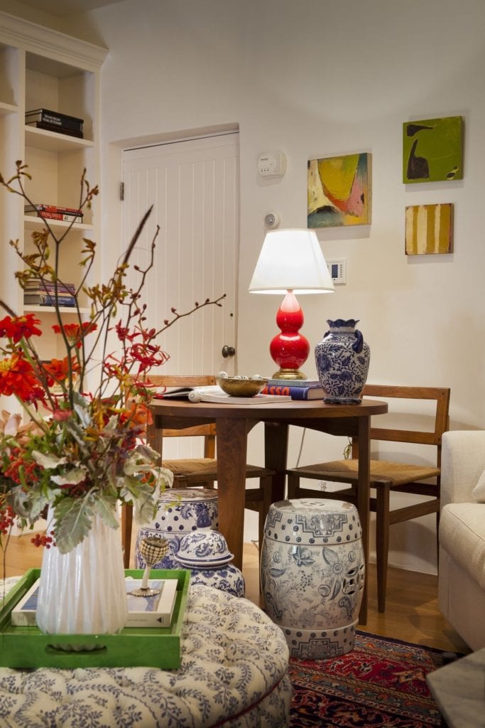
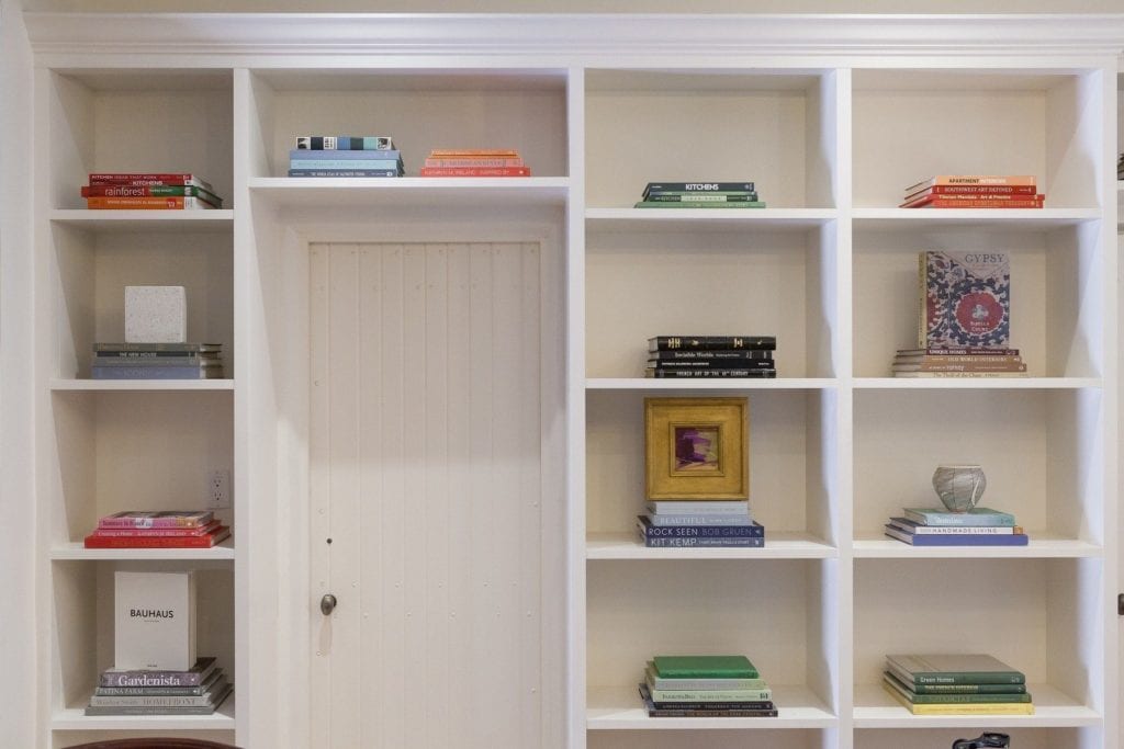
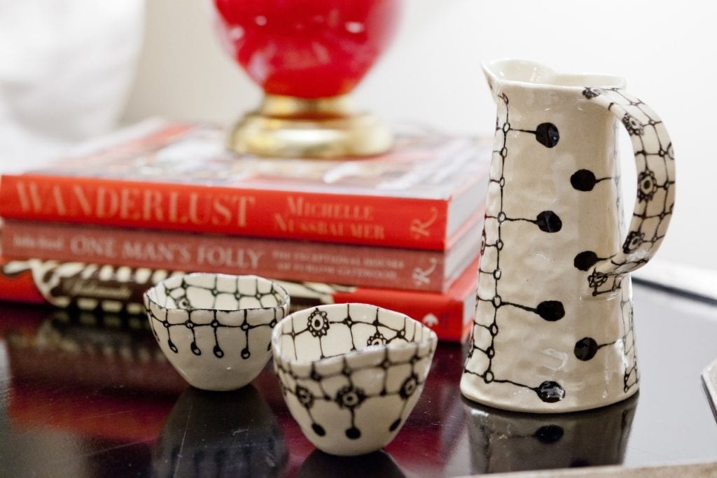
In the ShowHouse room, we also added a couple of key antiques and other pieces to help soften the look and make it feel more homey: the gold eagle mirror, blue and white garden stools, and ceramics serve this purpose. The bookshelf on the opposite wall from the bed also served to bring some order back to this room!
The great thing is that most people who come to check out ShowHouse really get its function: this is meant to be a fun and crazy experience that lets you see the most extreme design choices in action.
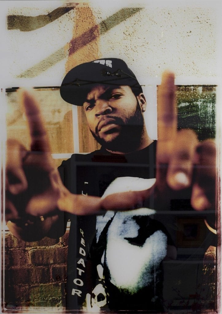
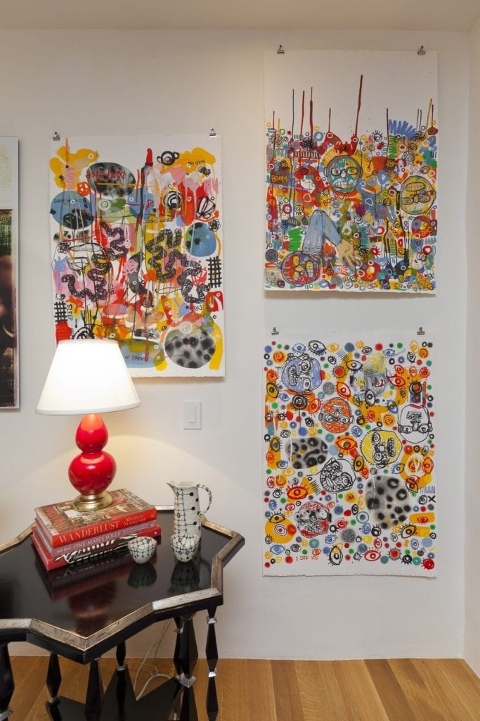
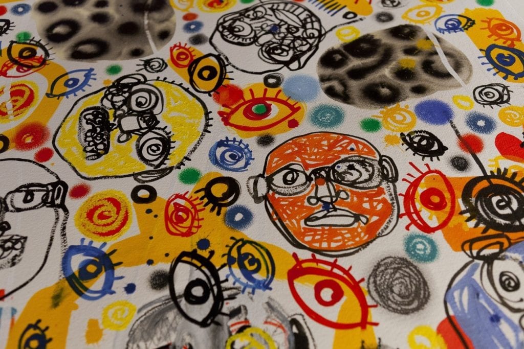
I’m always impressed by the response to pieces we choose to use in our rooms at ShowHouse 2017. Visitors love talking about the art and the fabrics; these are just such fun conversations for a designer to have!
This is especially true because Matt and I go out of our way to choose special fabrics you wouldn’t see every day, and it’s nice to have that effort appreciated when it all comes together.
Our Takeaways
Even though the preparations for this year’s ShowHouse were executed almost exactly as we’d anticipated, I think overall we did somewhat less planning than in the past. Part of that is being busier as a firm, but we’ve also become a little looser and less strict with how we work, which is especially fun during more of an experimental project like this.
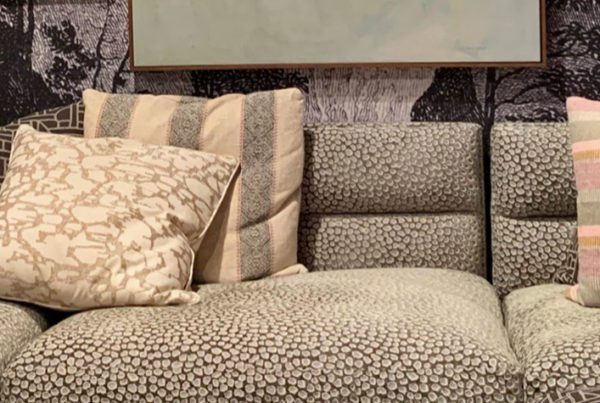
For example, this year I used a lot of smaller patterned fabrics on larger scale pieces. In the past, I might have chosen a solid fabric for that purpose, but now I can see how a small pattern functions to ground the space. It adds interest without being overwhelming, and brings the level down a bit from bigger, bolder patterns I used on smaller pieces (like the pillows and chairs).
Now I know I can layer even MORE patterns together in complementary ways…even without taking a space to ShowHouse levels!
We hope you enjoyed this roundup of our space in ShowHouse 2017, and that you find some inspiration to use in your own spaces! Thanks so much to everyone who stopped by our room to say hi, and to the wonderful Amadeus Leitner for the room photographs & Loren Haynes for the art photos!
Shop This Look!
One last thing, before you go: if you want to keep getting style tips and inspiration from us, feel free to
Subscribe


