A Bright and Fun Adobe Family House for Spring!
In today’s post, I get to feature yet another fun family house! With this client, we were working with an extensively remodeled 1950s adobe, which needed to be made brighter and cheerier yet still durable enough to meet the family’s needs.
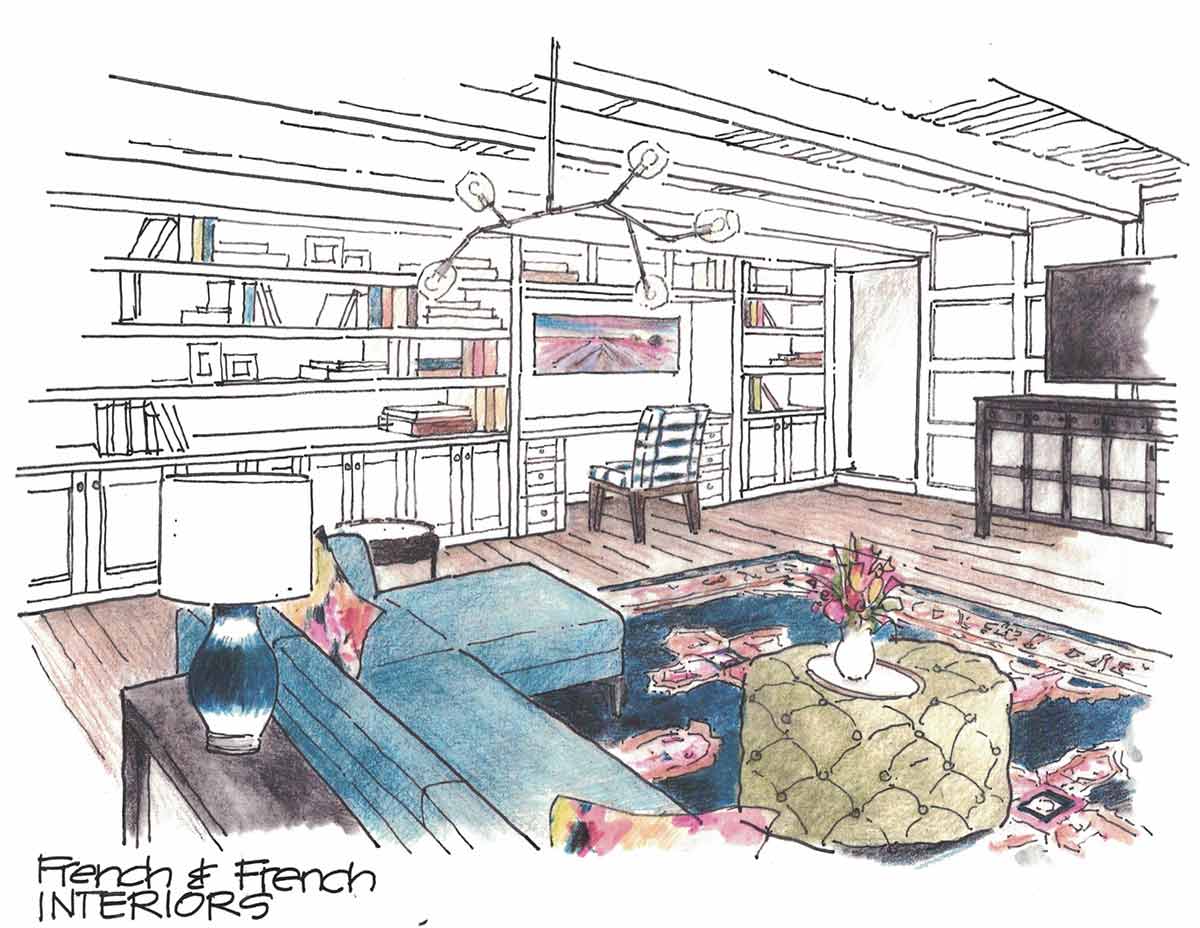
This adobe is home to three kiddos, and we really decided to highlight the playful aspect with materials that would last as this family grows up.

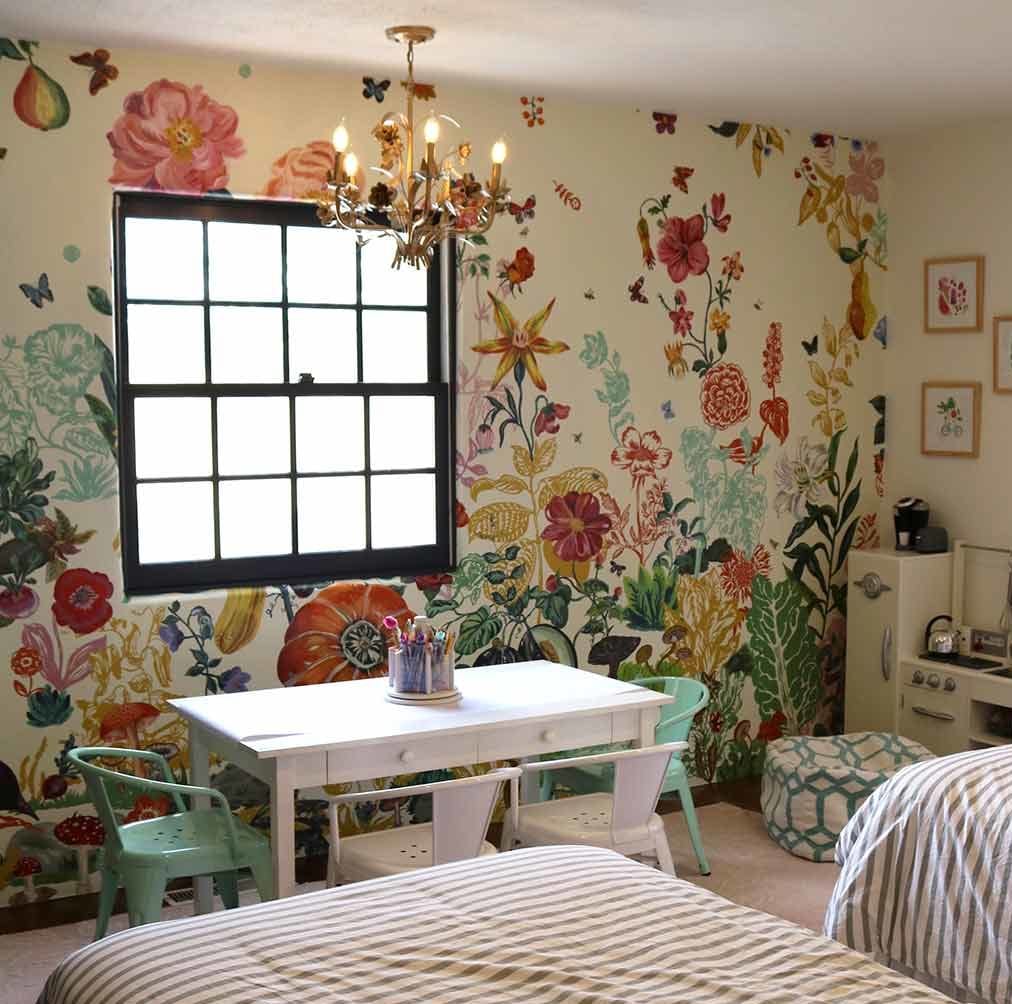
One of my favorite pieces we got to use here was this beautiful wallpaper mural by artist Natalie Lete *, which creates a huge visual impact in the daughters’ bedroom. I absolutely love the large scale and whimsical floral look — get a load of those snails and carrots!!
*Disclosure: This link is an affiliate link, meaning, at no additional cost to you, we will earn a commission if you click through and make a purchase.
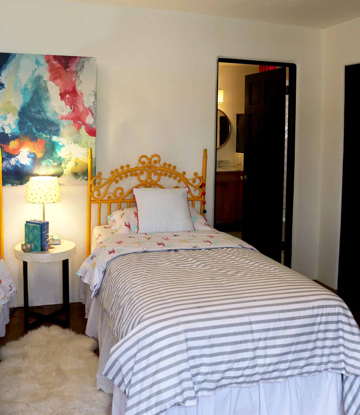
It’s artsy without being inaccessible, which I think strikes a perfect balance of playfulness and sophistication. Especially in kids’ rooms, I always feel like we can take a few more risks to make the space fun and playful. Using bold pieces like this takes a lot of trust on the client side, but of course we always run everything by them for approval first!
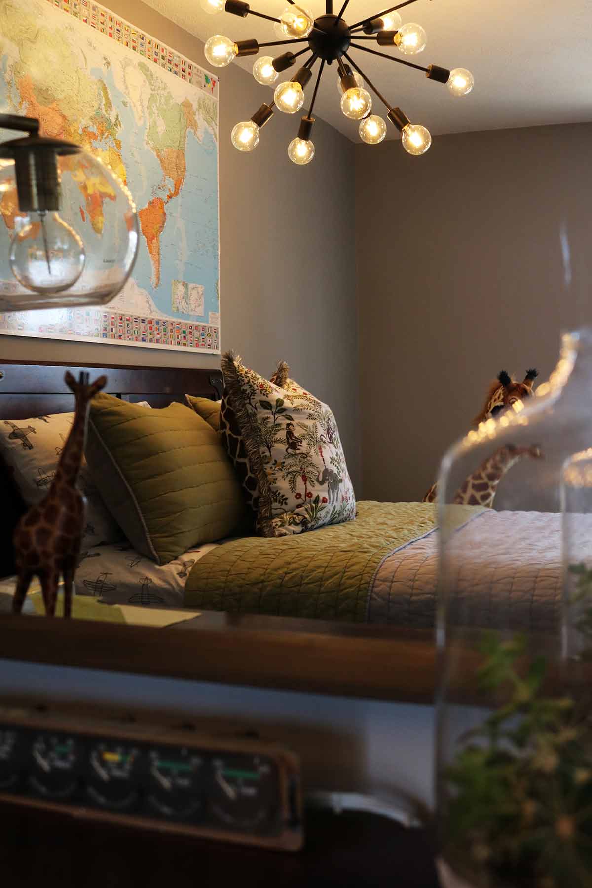
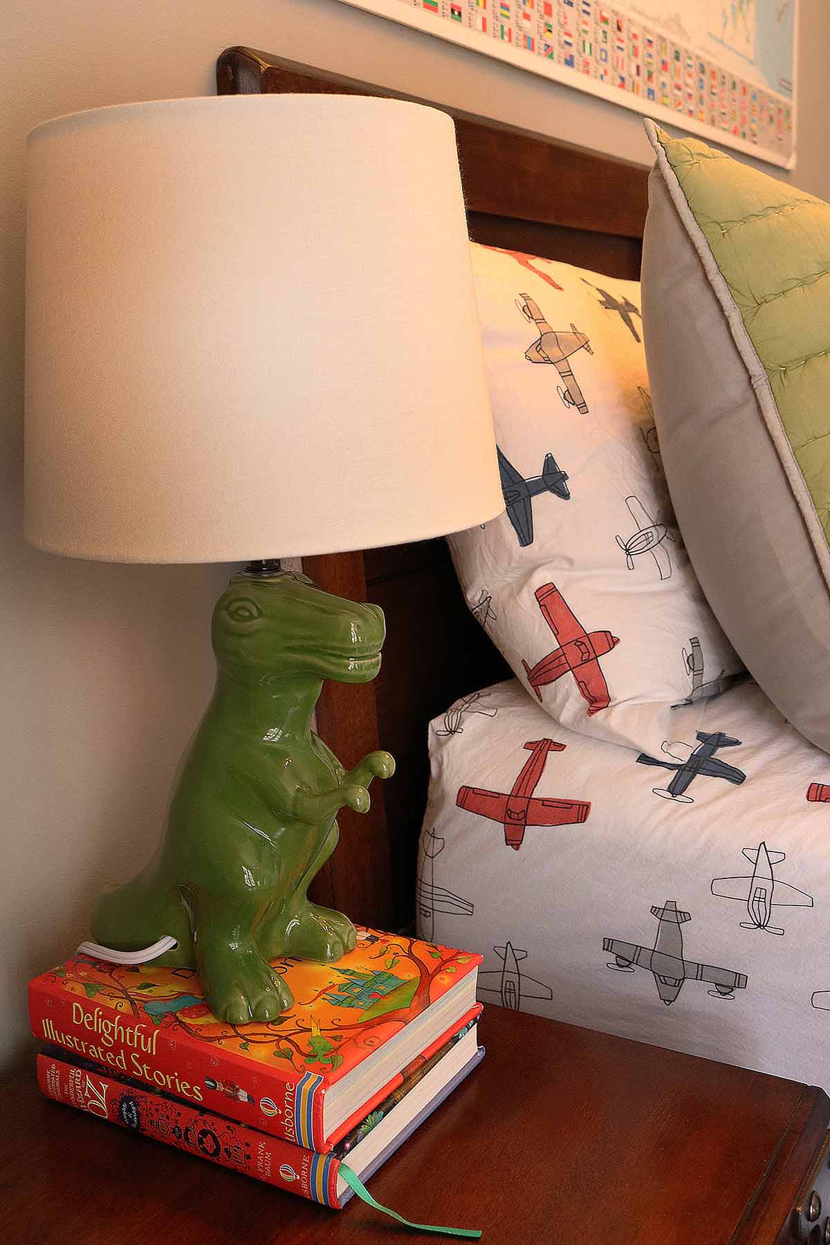
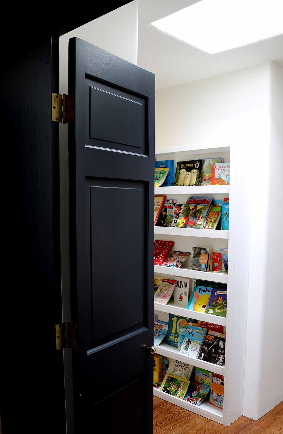
We also worked in the living room and master bedroom on this project. Both fireplaces were completely redone, and we added a ton of great built-ins for storage.
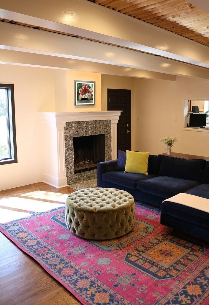
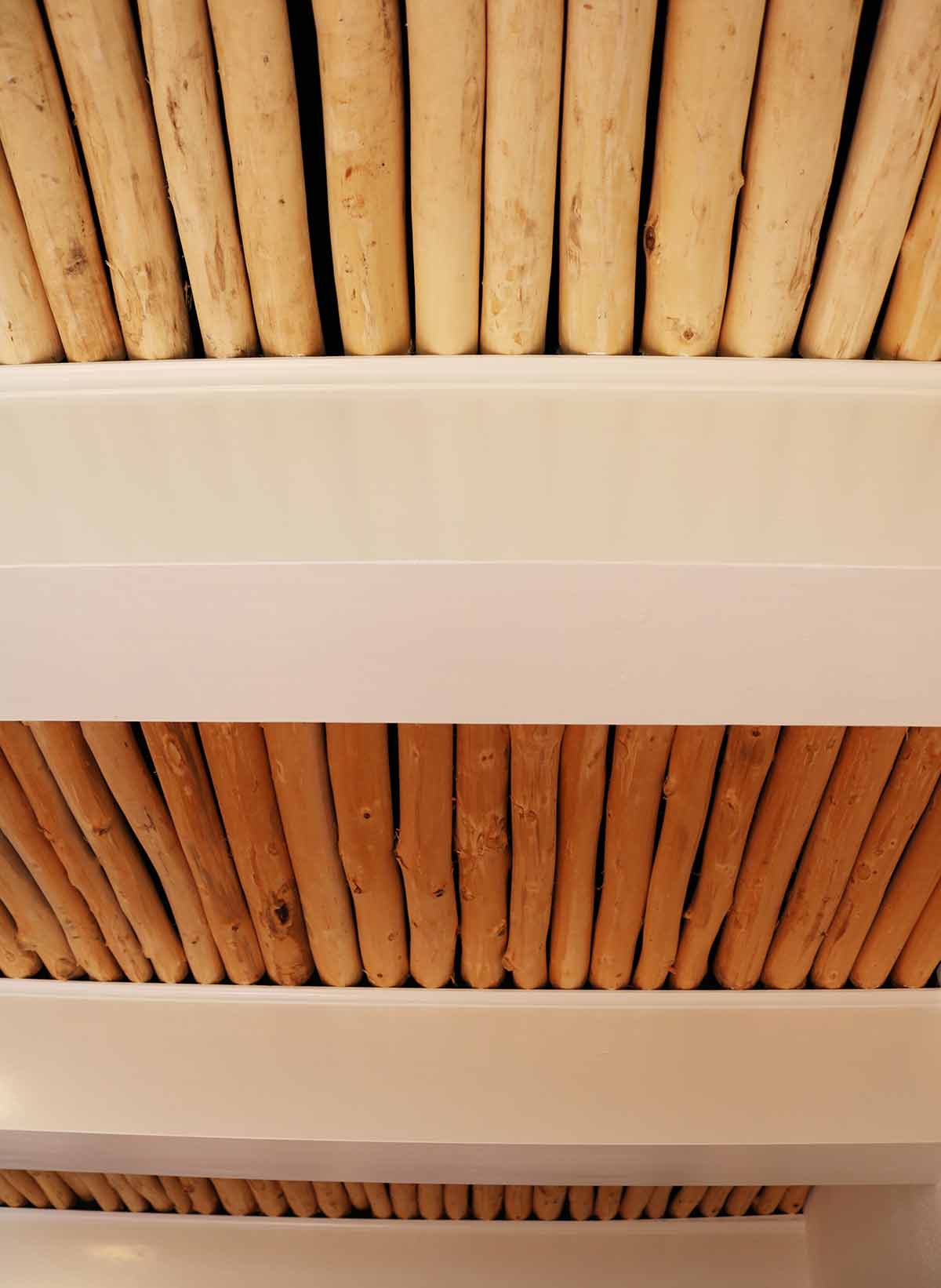
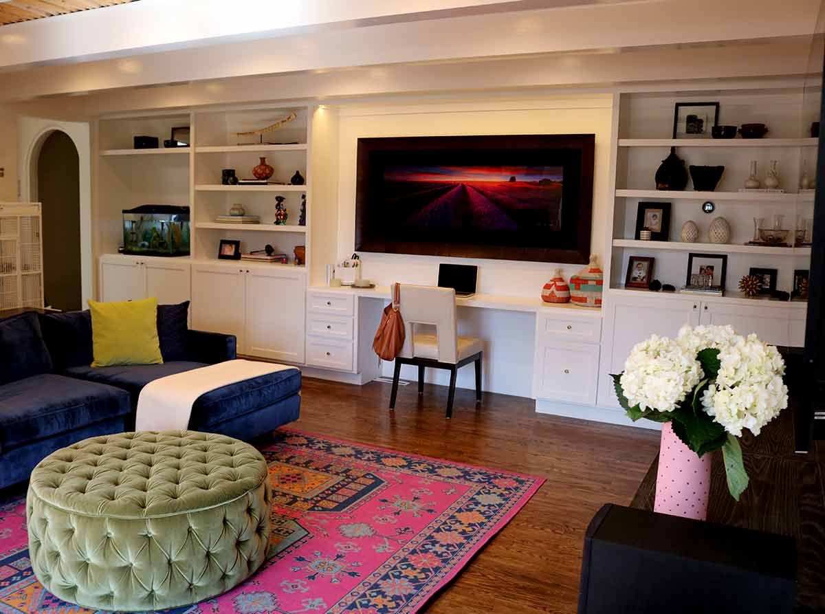
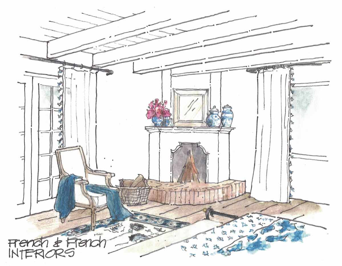
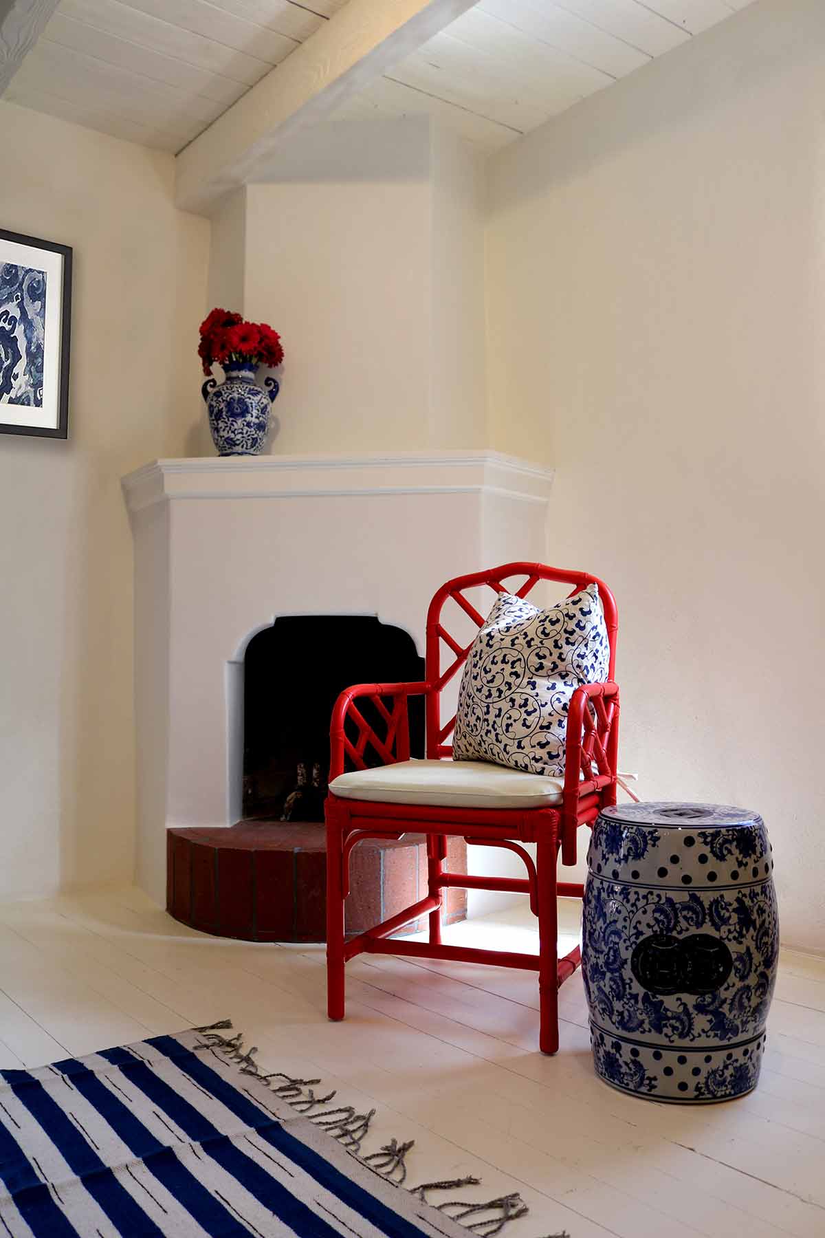
In the master you’ll see these white painted floors, which add a lot of warmth to the space. The fireplace here had been huge before and covered with overwhelming 80s tile — we brought this down to scale and made it more appropriate to what a 1950s adobe would have had. Now it’s shaped plaster with a brick floor, which adds so much charm to this space and complements the overall feel we were going for.
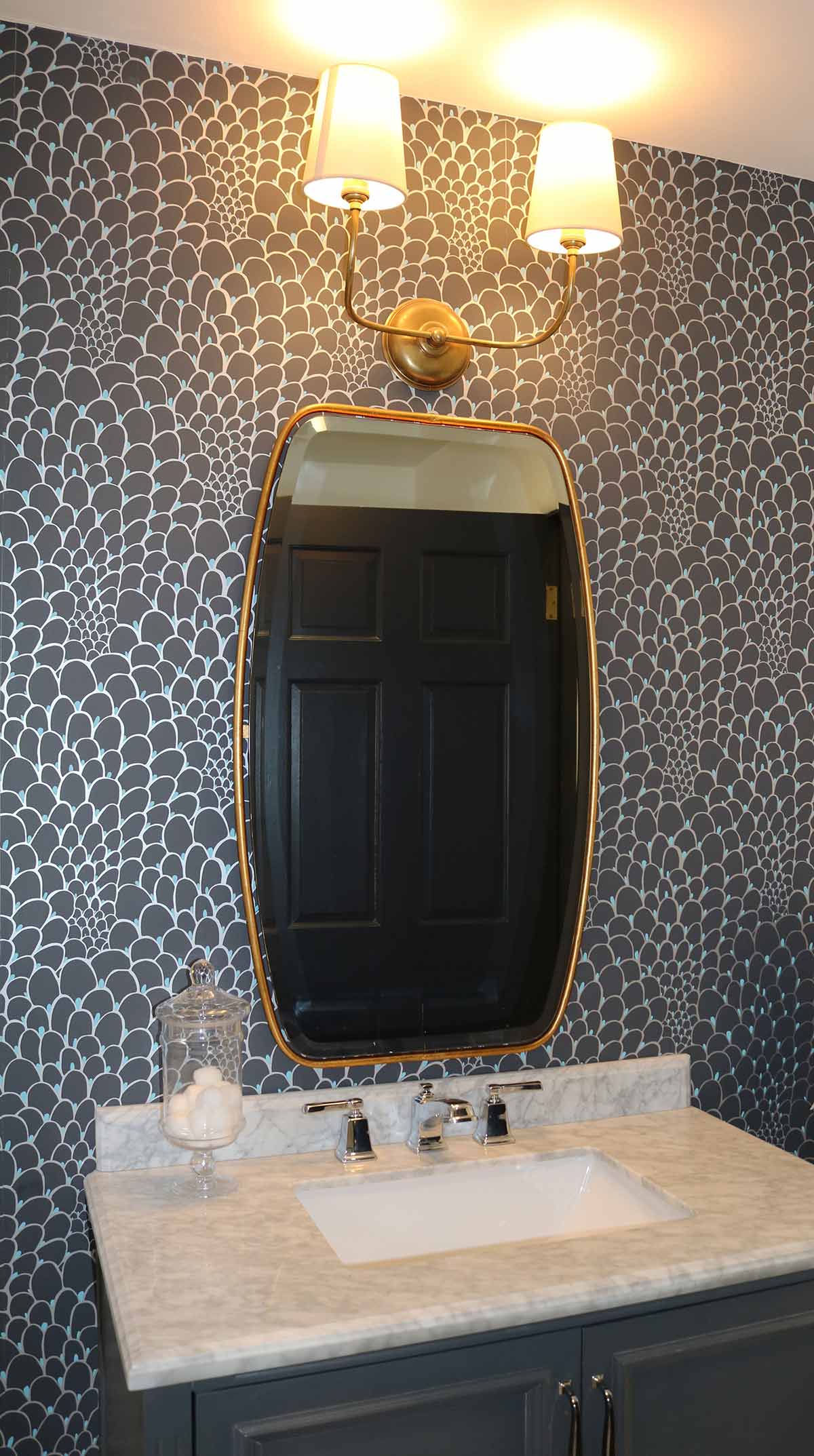
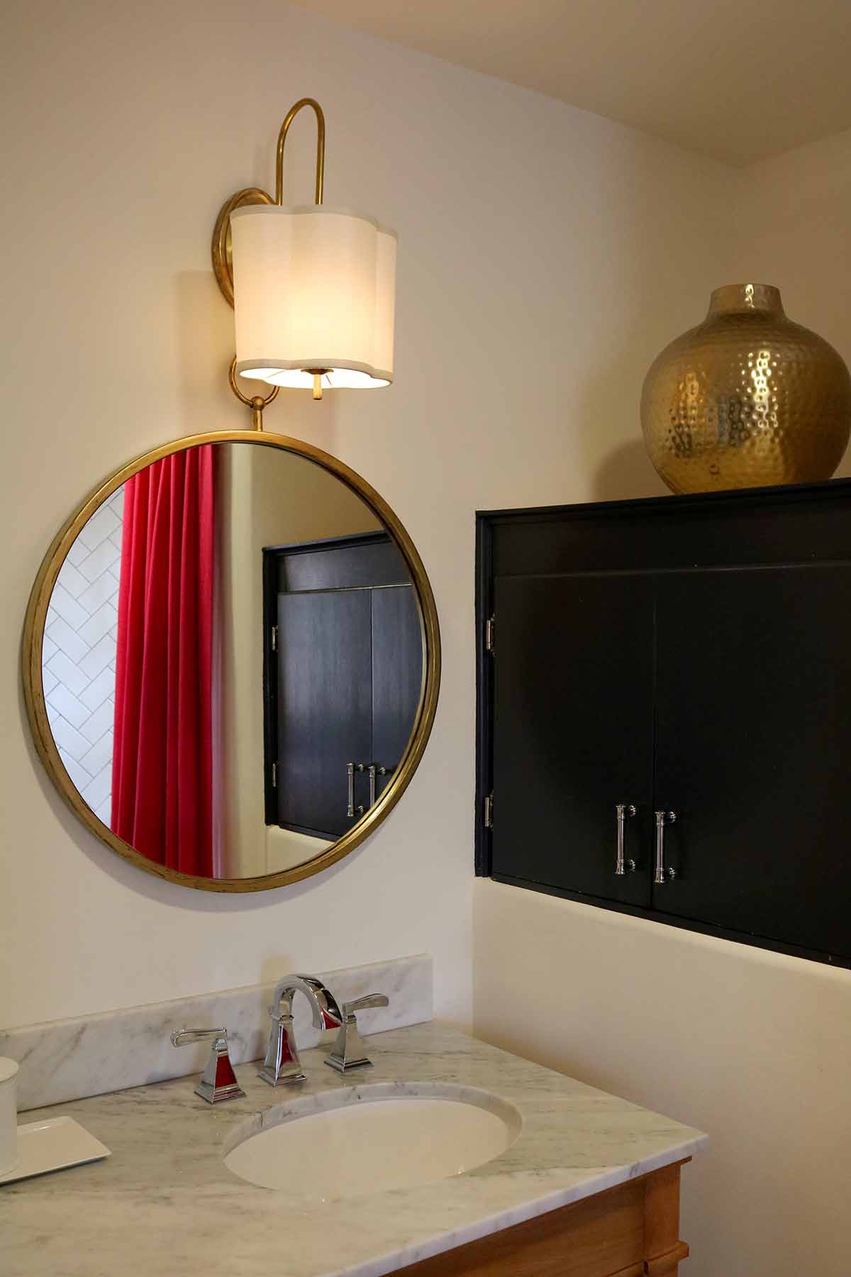
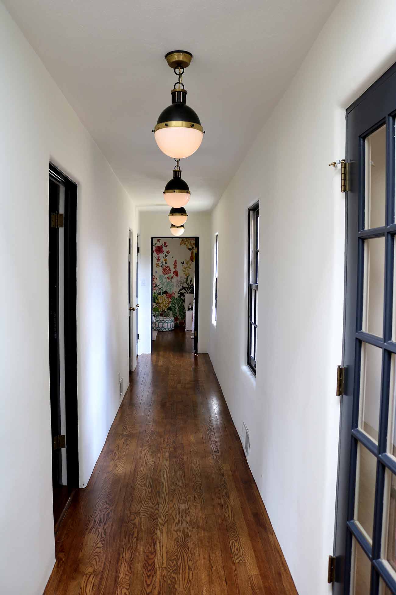
Finally, we remodeled two bathrooms, an office, and created this gorgeous hallway connecting it all!
Get more inspiration right in your inbox


