The Value of Design and Designers
Where can you take design when you really push it? When you have total freedom to go all out?
Below, you’ll see the video from this year’s Showhouse Santa Fe. We’re really excited about how this year’s house turned out, and the process has us thinking – how does the client benefit when the designer goes “all out”?
The purpose of the Showhouse is to be… showy. Over the top. And yet, what was created was not only over-the-top, but beautiful, functional space. This is the value that designers bring to a project.
Value of Design: What Designers Bring to the Table
In a typical project, clients task designers with presenting space options based on budget. Regardless of the budget, whether shoestring or carte blanche, designers help clients see spaces through new eyes. An excellent designer allows more beauty, function, and peace to unfold from a space. Often we hear our clients exclaim, “Wow! I never thought of using the space this way.”
Value of Design: Step-by-Step through Showhouse Santa Fe
The Entrance:
My room was the foyer, which is a long, narrow space: oddly shaped at about 30 feet long by 7 feet wide. Entrances are often overlooked spaces. We typically breeze right through them, perhaps stopping only to drop our keys or a piece of mail. That attitude tends to show in our home decorating too: entryways often have only a single piece of artwork, and maybe a side table.
What if we elevated our entryways?
I wanted to create a visual stop in the space, as well as enhance function. Since this entryway has another opening into the garden, I saw an opportunity to create a comfy reading spot: a place of peace, where you could throw open the doors to the garden and enjoy the view.
The theme for this year’s ShowHouse was “Everything Old is New Again Mexico.” An aesthetic revival of Colonial Mexico, married with the New Mexico of today. I took my inspiration from artist Frida Kahlo, and went over the top with it, incorporating bold, vibrant colors, and soft, loungy furniture that invites you to take a seat.
The Media Center
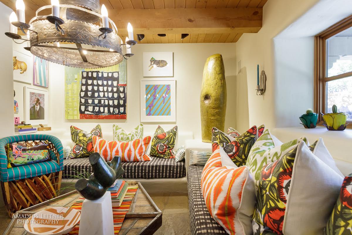
Matt was tasked with bringing the media center – a room which we quickly nicknamed the “keyhole room” – to life.
Matt’s inspiration was New Mexico’s storied history: in particular, the Pueblo Rebellion of 1680, also known as Popé’s Revolt. The rustic adobe on the walls not only offers textural interest and warmth, it’s a nod to an age-old building material used across the region.
The ropes are a direct reference to Popé’s Revolt. Many of the enslaved, indigenous people couldn’t read. There was no way to develop a calendar. But, Popé devised an ingenious way of communicating. Every participant was given a small piece of rope with five knots. Every morning, they would untie a knot. When the rope was free of knots, the revolt was to begin.
Since media in the modern age is used for entertainment and comfort, as well as communication, Matt wanted the room to be cozy and warm. An inviting place to relax and kick back. The room is filled with a myriad of pillows in multiple fabrics, that you can arrange in endless combination.
The Value of Design: When The Project is Complete
We designers get attached to our projects! At the end of a project, I feel a little bit like a parent who has given birth to something special. Each design is like a child, with unique and lovable qualities.
This year’s ShowHouse was no different. This house has “soul.” It’s been well-loved over the years, and it feels like there are stories in every nook and cranny. One special local touch is the staircase, which is embedded with rocks collected from the Nambe River in the 1970s. Visit the ShowHouse Santa Fe website for a brief history of this beautiful and unusual house.
Before:


